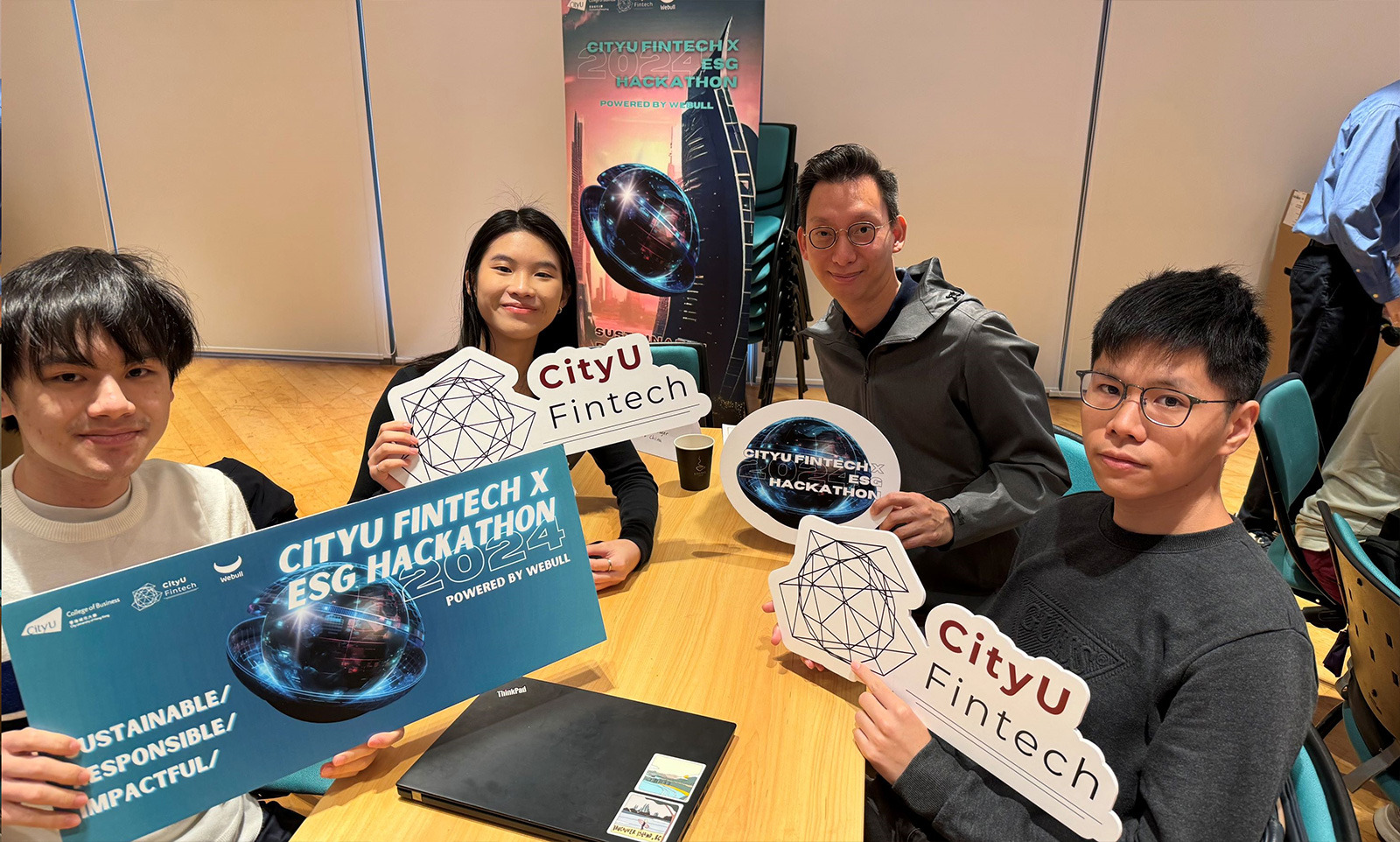
Image caption: Lorem ipsum dolor sit amet, consectetur adipiscing elit.


<h1>Header 1 — Lead What's Next</h1>
This page contains one major component — freshcb-richtext — and showcases how the simplest rich-text elements (headings, paragraphs, lists, quotes) are styled when placed inside its .richtext-container.
<p>This page contains one major component — freshcb-richtext — and showcases how the simplest rich-text elements (headings, paragraphs, lists, quotes) are styled when placed inside its .richtext-container.</p>
<h2>Header 2 — Research That Moves Industries Forward</h2>
Lorem ipsum dolor sit amet, consectetur adipiscing elit. Tempor sagittis nisl, scelerisque in vitae dolor feugiat nunc. Vestibulum diam in sit nisl rutrum accumsan non. Pulvinar fames tellus quis.
<p>Lorem ipsum dolor sit amet, consectetur adipiscing elit. Tempor sagittis nisl, scelerisque in vitae dolor feugiat nunc. Vestibulum diam in sit nisl rutrum accumsan non. Pulvinar fames tellus quis.</p>
<h3>Header 3 — Globally Accredited Credentials</h3>
Lorem ipsum dolor sit amet, consectetur adipiscing elit. Tempor sagittis nisl, scelerisque in vitae dolor feugiat nunc. Vestibulum diam in sit nisl rutrum accumsan non.
<p>Lorem ipsum dolor sit amet, consectetur adipiscing elit. Tempor sagittis nisl, scelerisque in vitae dolor feugiat nunc. Vestibulum diam in sit nisl rutrum accumsan non.</p>
<h4>Header 4 — Department of Accountancy</h4>
Paragraph with bold text and strong text — both render with font-weight 600 inside the component.
<p>Paragraph with <b>bold text</b> and <strong>strong text</strong> — both render with font-weight 600 inside the component.</p>
<ul>
  <li>Lorem ipsum 1</li>
  <li>Lorem ipsum 2</li>
  <li>Lorem ipsum 3</li>
  <li>Lorem ipsum 4</li>
  <li>Lorem ipsum 5</li>
</ul>
Lorem ipsum dolor sit amet, consectetur adipiscing elit. Tempor sagittis nisl, scelerisque in vitae dolor feugiat nunc. Vestibulum diam in sit nisl rutrum accumsan non.
— AUTHOR, TITLE
<blockquote>
  <p>Lorem ipsum dolor sit amet, consectetur adipiscing elit. Tempor sagittis nisl, scelerisque in vitae dolor feugiat nunc. Vestibulum diam in sit nisl rutrum accumsan non.</p>
  <cite>— AUTHOR, TITLE</cite>
</blockquote>
Apply any .typo-{name} class to an element to style it regardless of its tag. Classes are mobile-first and switch to the desktop size at 768px+.
typo-display-regular — City University of Hong Kong
<p class="typo-display-regular">typo-display-regular — City University of Hong Kong</p>
typo-h1-semibold — Lead What's Next
<p class="typo-h1-semibold">typo-h1-semibold — Lead What's Next</p>
typo-h1-regular — Lead What's Next
<p class="typo-h1-regular">typo-h1-regular — Lead What's Next</p>
typo-h2-semibold — Research That Moves Industries Forward
<p class="typo-h2-semibold">typo-h2-semibold — Research That Moves Industries Forward</p>
typo-h2-regular — Research That Moves Industries Forward
<p class="typo-h2-regular">typo-h2-regular — Research That Moves Industries Forward</p>
typo-h3-semibold — Globally Accredited Credentials
<p class="typo-h3-semibold">typo-h3-semibold — Globally Accredited Credentials</p>
typo-h3-regular — Globally Accredited Credentials
<p class="typo-h3-regular">typo-h3-regular — Globally Accredited Credentials</p>
typo-h4-semibold — Accounting
<p class="typo-h4-semibold">typo-h4-semibold — Accounting</p>
typo-h4-regular — Accounting
<p class="typo-h4-regular">typo-h4-regular — Accounting</p>
typo-h5-semibold — Department of Accountancy
<p class="typo-h5-semibold">typo-h5-semibold — Department of Accountancy</p>
typo-h5-regular — Department of Accountancy
<p class="typo-h5-regular">typo-h5-regular — Department of Accountancy</p>
typo-h6-semibold — Section label
<p class="typo-h6-semibold">typo-h6-semibold — Section label</p>
typo-h6-regular — Section label
<p class="typo-h6-regular">typo-h6-regular — Section label</p>
typo-sh1-regular — Subheading text used for secondary information
<p class="typo-sh1-regular">typo-sh1-regular — Subheading text used for secondary information</p>
typo-paragraph-regular — City University of Hong Kong (CityUHK) is a leading university in Asia, known for its innovative approach to professional education and research.
<p class="typo-paragraph-regular">typo-paragraph-regular — City University of Hong Kong (CityUHK) is a leading university in Asia, known for its innovative approach to professional education and research.</p>
typo-CTA-semibold — Learn More →
<p class="typo-CTA-semibold">typo-CTA-semibold — Learn More →</p>
typo-small-text-semibold — Captions and metadata
<p class="typo-small-text-semibold">typo-small-text-semibold — Captions and metadata</p>
Combine .typo-{name} (mobile-first) with {bp}:typo-{name} variants to switch typography levels at specific viewport widths. Resize the browser to see each switch.
Default: h3-regular · 1024px+: h3-semibold (text-slate-blue)
<p class="typo-h3-regular lg:typo-h3-semibold text-slate-blue">Default: h3-regular · 1024px+: h3-semibold (text-slate-blue)</p>
Default: h4-regular · 390px+: h3-semibold
<p class="typo-h4-regular sm:typo-h3-semibold">Default: h4-regular · 390px+: h3-semibold</p>
Default: paragraph-regular · 768px+: h5-semibold
<p class="typo-paragraph-regular md:typo-h5-semibold">Default: paragraph-regular · 768px+: h5-semibold</p>
Default: h5-regular · 1280px+: h3-semibold
<p class="typo-h5-regular xl:typo-h3-semibold">Default: h5-regular · 1280px+: h3-semibold</p>
Video short description · 2 mins · Read Transcript
<section class="freshcb-video-block-c40" aria-label="Featured video">
<div class="c40-content">
<div class="c40-media">
<video class="c40-video-image" src="/cb/-/media/project/cityuhk/academic/cb202603/image/news/20260421/redpandacompress_video1.mp4" preload="metadata" playsinline aria-label="Featured video"></video>
<button class="c40-play-background" type="button" aria-label="Play video" aria-pressed="false">
<span class="c40-play-icon" aria-hidden="true"></span>
</button>
</div>
<p class="c40-caption">
<span class="c40-caption-details">Video short description · 2 mins · </span>
<a class="c40-transcript-link" href="#" aria-label="Read the video transcript">Read Transcript</a>
</p>
</div>
</section>
Video short description · 2 mins · Read Transcript
<section class="freshcb-video-block-c40" aria-label="Featured video">
<div class="c40-content">
<div class="c40-media">
<video class="c40-video-image" src="https://youtu.be/PVdCeVcQax4" preload="metadata" playsinline aria-label="Featured video"></video>
<button class="c40-play-background" type="button" aria-label="Play video" aria-pressed="false">
<span class="c40-play-icon" aria-hidden="true"></span>
</button>
</div>
<p class="c40-caption">
<span class="c40-caption-details">Video short description · 2 mins · </span>
<a class="c40-transcript-link" href="#" aria-label="Read the video transcript">Read Transcript</a>
</p>
</div>
</section>
YouTube support. This variant keeps the exact c40 video-block markup, but when the
<video> src is a YouTube link its component.js swaps the native player
and play overlay for a YouTube embed (the player brings its own controls). Supported source formats:
https://youtu.be/<video-id> — short linkshttps://www.youtube.com/watch?v=<video-id> — watch pageshttps://www.youtube.com/embed/<video-id> — embed URLshttps://www.youtube.com/shorts/<video-id> — Shortshttps://m.youtube.com/watch?v=<video-id> — mobile sitehttps://www.youtube-nocookie.com/embed/<video-id> — privacy-enhanced embeds
Image caption: Lorem ipsum dolor sit amet, consectetur adipiscing elit.
Image caption: Lorem ipsum dolor sit amet, consectetur adipiscing elit.
<section class="freshcb-image-blog-c44" aria-label="Image blog">
      <div class="c44-container">
        <div class="c44-list">
          <article class="c44-item" aria-labelledby="c44-caption-1">
            <div class="c44-image-wrap">
              <img
                class="c44-image"
                src="-/media/c52e689155694110a2c90142da156c4d.ashx"
                alt="Editorial image for blog card one"
              />
            </div>
            <p class="c44-caption" id="c44-caption-1">
              Image caption: Lorem ipsum dolor sit amet, consectetur adipiscing
              elit.
            </p>
          </article>
          <article class="c44-item" aria-labelledby="c44-caption-2">
            <div class="c44-image-wrap">
              <img
                class="c44-image"
                src="-/media/c52e689155694110a2c90142da156c4d.ashx"
                alt="Editorial image for blog card two"
              />
            </div>
            <p class="c44-caption" id="c44-caption-2">
              Image caption: Lorem ipsum dolor sit amet, consectetur adipiscing
              elit.
            </p>
          </article>
        </div>
      </div>
    </section>
Image caption: Lorem ipsum dolor sit amet, consectetur adipiscing elit.
The department's studios double as seminar rooms: classes in financial modelling run beside live data terminals, and capstone students present their audit findings to the partner who supervised them. It is this constant contact with practice — from the first lecture to the final placement — that makes a CityUHK accountancy graduate recognisable within the first week of a new job.
<section class="freshcb-image-blog-c44 text" aria-label="Image blog with text block">
      <div class="c44-container">
        <div class="c44-list">
          <article class="c44-item" aria-labelledby="c44-text-caption-1">
            <div class="c44-image-wrap">
              <img
                class="c44-image"
                src="-/media/c52e689155694110a2c90142da156c4d.ashx"
                alt="Editorial image for blog card one"
              />
            </div>
            <p class="c44-caption" id="c44-text-caption-1">
              Image caption: Lorem ipsum dolor sit amet, consectetur adipiscing
              elit.
            </p>
          </article>
          <article class="c44-item">
            <div class="c44-text">
                <p class="typo-paragraph-regular text-black">
                  The department's studios double as seminar rooms: classes in
                  financial modelling run beside live data terminals, and capstone
                  students present their audit findings to the partner who
                  supervised them. It is this constant contact with practice — from
                  the first lecture to the final placement — that makes a CityUHK
                  accountancy graduate recognisable within the first week of a new
                  job.
                </p>
            </div>
          </article>
        </div>
      </div>
    </section>
The department's studios double as seminar rooms: classes in financial modelling run beside live data terminals, and capstone students present their audit findings to the partner who supervised them. It is this constant contact with practice — from the first lecture to the final placement — that makes a CityUHK accountancy graduate recognisable within the first week of a new job.
Image caption: Lorem ipsum dolor sit amet, consectetur adipiscing elit.
<section class="freshcb-image-blog-c44 text" aria-label="Image blog with text block">
      <div class="c44-container">
        <div class="c44-list">
          <article class="c44-item">
            <div class="c44-text">
                <p class="typo-paragraph-regular text-black">
                  The department's studios double as seminar rooms: classes in
                  financial modelling run beside live data terminals, and capstone
                  students present their audit findings to the partner who
                  supervised them. It is this constant contact with practice — from
                  the first lecture to the final placement — that makes a CityUHK
                  accountancy graduate recognisable within the first week of a new
                  job.
                </p>
            </div>
          </article>
          <article class="c44-item" aria-labelledby="c44-text-caption-1">
            <div class="c44-image-wrap">
              <img
                class="c44-image"
                src="-/media/c52e689155694110a2c90142da156c4d.ashx"
                alt="Editorial image for blog card one"
              />
            </div>
            <p class="c44-caption" id="c44-text-caption-1">
              Image caption: Lorem ipsum dolor sit amet, consectetur adipiscing
              elit.
            </p>
          </article>
        </div>
      </div>
    </section>
Image caption: Lorem ipsum dolor sit amet, consectetur adipiscing elit.
Accountancy · Feature
The department's studios double as seminar rooms: classes in financial modelling run beside live data terminals, and capstone students present their audit findings to the partner who supervised them.
It is this constant contact with practice — from the first lecture to the final placement — that makes a CityUHK accountancy graduate recognisable within the first week of a new job.
<section class="freshcb-image-blog-c44 text" aria-label="Image blog with text block">
      <div class="c44-container">
        <div class="c44-list">
          <article class="c44-item" aria-labelledby="c44-text-caption-1">
            <div class="c44-image-wrap">
              <img
                class="c44-image"
                src="-/media/c52e689155694110a2c90142da156c4d.ashx"
                alt="Editorial image for blog card one"
              />
            </div>
            <p class="c44-caption" id="c44-text-caption-1">
              Image caption: Lorem ipsum dolor sit amet, consectetur adipiscing
              elit.
            </p>
          </article>
          <article class="c44-item">
            <div class="c44-text">
              <p class="typo-small-text-semibold text-slate-blue">Accountancy · Feature</p>
              <h3 class="typo-h3-semibold text-black">From the trading floor to the seminar room</h3>
              <p class="typo-paragraph-regular text-black">
                The department's studios double as seminar rooms: classes in
                financial modelling run beside live data terminals, and capstone
                students present their audit findings to the partner who
                supervised them.
              </p>
              <p class="typo-paragraph-regular text-black">
                It is this <span class="text-deep-fuschia">constant contact with practice</span> — from
                the first lecture to the final placement — that makes a CityUHK
                accountancy graduate recognisable within the first week of a new
                job.
              </p>
              <p class="typo-CTA-semibold">
                <a href="#" class="text-slate-blue" style="text-decoration: none">Read the full story →</a>
              </p>
            </div>
          </article>
        </div>
      </div>
    </section>
freshcb-gallery-c44 on-the-fly — write a simple image list; component.js builds and initializes the full swiper (main slides, thumbnail strip, caption, desktop + mobile nav) at runtime.
<section class="freshcb-gallery-c44 on-the-fly" aria-label="Life at the College — on-the-fly gallery">
  <div class="c44-simple-list">
    <img src="-/media/c52e689155694110a2c90142da156c4d.ashx" alt="Campus life" />
    <img src="-/media/c52e689155694110a2c90142da156c4d.ashx" />
    <img src="-/media/c52e689155694110a2c90142da156c4d.ashx" alt="Graduation ceremony" />
    <img src="-/media/c52e689155694110a2c90142da156c4d.ashx" alt="Research showcase" />
    <img src="-/media/c52e689155694110a2c90142da156c4d.ashx" alt="International exchange" />
  </div>
</section>
md:grid-cols-2 (768px+), single column on mobilelg:grid-cols-3 (1024px+), single column on mobilelg:grid-cols-2, stacked until 1024pxlg:grid-cols-2-1 (1024px+), stacked on mobilelg:grid-cols-1-2 (1024px+), stacked on mobile
Usage: Use .freshcb-row as the grid container. Add .gap-{4..15} for spacing. Set column count on the row with .md:grid-cols-2, .lg:grid-cols-3, etc. CSS Grid handles gaps natively — no brittle calc() needed. Resize browser to see columns
stack on mobile.
Use .text-{name} and .bg-{name} to apply styleguide colors.